728x90
반응형
안녕하세요. ^-^
오늘은 전에 했던 거에 이어서
배경이미지를 blur를 줘서
흐릿~~ 하게 만들어 보겠습니다.

[ html ]은 전과 동일합니다.
|
1
2
3
4
5
6
7
8
9
10
11
12
13
14
15
16
|
<!DOCTYPE html>
<html lang="en">
<head>
<meta charset="UTF-8">
<meta http-equiv="X-UA-Compatible" content="IE=edge">
<meta name="viewport" content="width=device-width, initial-scale=1.0">
<title>Document</title>
<link rel="stylesheet" href="style.css">
</head>
<body>
<section>
<h3>어서오세요</h3>
<p>백그라운드 이미지 채도를 조절해 봅시다!!</p>
</section>
</body>
</html>
|
cs |
[ css ]도 비슷합니다.
일단 블러가 들어가지 않은 상태를 먼저 보여드릴게요.

|
1
2
3
4
5
6
7
8
9
10
11
12
13
14
15
16
17
18
19
20
21
22
23
24
25
26
27
28
29
30
31
32
33
34
|
*{
margin:0;
padding:0;
box-sizing:border-box;
}
section{
height:500px;
position:relative;
padding:100px 0 50px;
overflow:hidden;
background:url(images/test.jpg) no-repeat center center;
z-index: 1;
}
section:after{
content:'';
background:rgba(0,0,0,0.5);
position:absolute;
top:0;
left:0;
right:0;
width:100%;
height:100%;
z-index: -1;
}
section h3{
font-size:50px;
text-align:center;
color:#ffffff;
}
section p{
font-size:30px;
text-align:center;
color:#ffffff;
}
|
cs |
실행을 하면 이렇게 나온답니다.
저 왼쪽 무늬에 opacity와 filter를 줘볼게요.

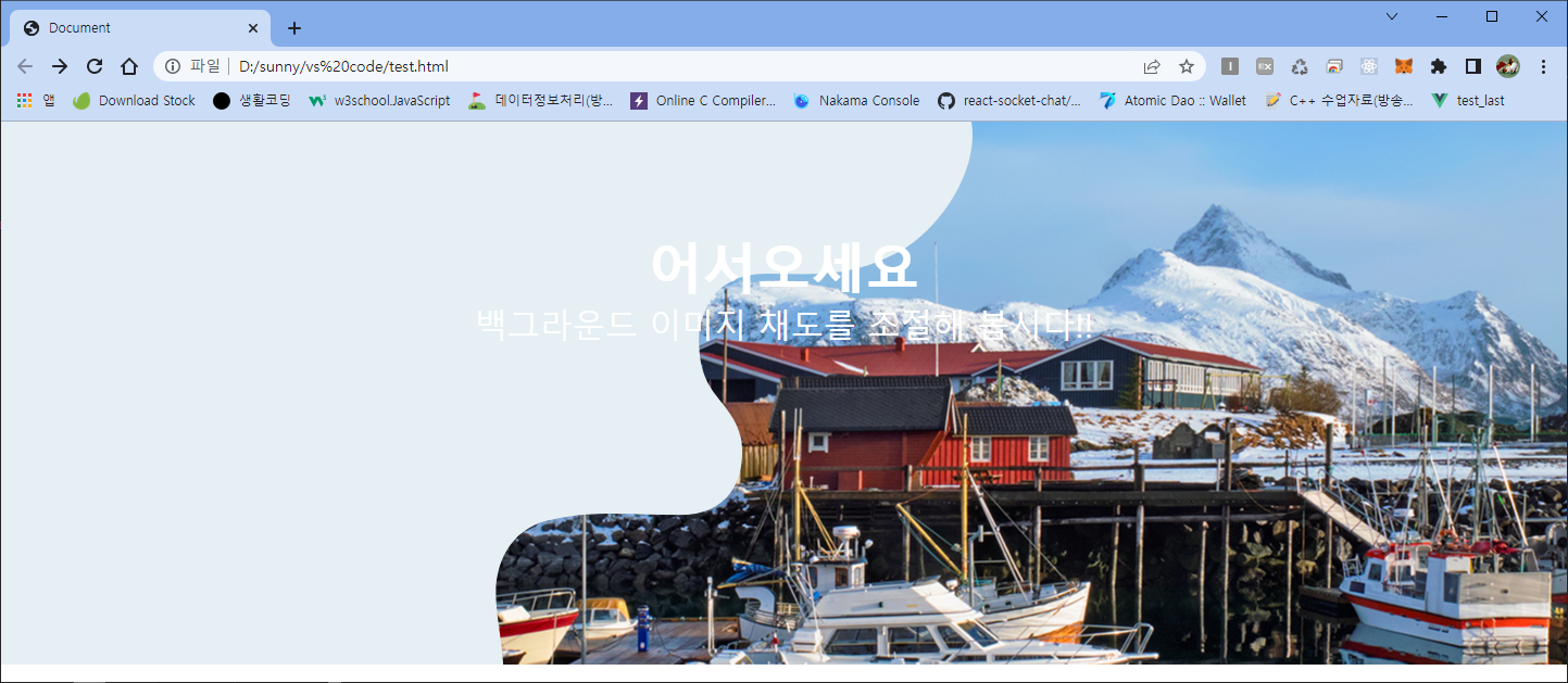
[ css ]는 이렇게입니다. 아까와 많이 비슷해요
추가된 부분은 opacity:0.8과 fliter:blur(20px) 입니다.
728x90
|
1
2
3
4
5
6
7
8
9
10
11
12
13
14
15
16
17
18
19
20
21
22
23
24
25
26
27
28
29
30
31
32
33
34
35
36
37
|
*{
margin:0;
padding:0;
box-sizing:border-box;
}
section{
height:500px;
position:relative;
padding:100px 0 50px;
overflow:hidden;
background:url(images/test.jpg) no-repeat center center;
z-index: 1;
}
section:after{
content:'';
background:rgba(0,0,0,0.5);
position:absolute;
top:0;
left:0;
right:0;
width:100%;
height:100%;
z-index: -1;
background:url(images/transparent.svg) no-repeat top left;
filter:blur(20px);
opacity:0.8
}
section h3{
font-size:50px;
text-align:center;
color:#ffffff;
}
section p{
font-size:30px;
text-align:center;
color:#ffffff;
}
|
cs |
실행하면 이렇게 됩니다.
좀 더 확실하게 보이게 하기 위해 opacity를 많이 주지 않았어요.
좀 더 많이 번지게 하고 싶으시면 fliter:blur값을 더 많이 주면 됩니다.
그리고 좀 더 연하게 하고 싶으시면 opacity값을 적게 주시면 됩니다.

아주 간단하죠?
간단한 코드 하나로 원하는 디자인을 만들 수 있다니
정말 신기합니다.
다음에도 간단하게 만들 수 있는 코드
들고 와 볼게요.
월요일의 시작입니다.
축축 늘어지는 기분을 다잡고
한주 힘차게 시작해 봐요~~

728x90
반응형
'코딩 어린이의 노트' 카테고리의 다른 글
| 원형 그라데이션 배경색을 만들어 보자 (0) | 2023.02.11 |
|---|---|
| 그라데이션 배경색 만들기 (0) | 2023.02.10 |
| 배경이미지의 채도를 조절해요 (0) | 2023.02.01 |
| CSS 배경이미지만 투명하게 만들 (1) | 2023.01.27 |
| [jquery] scroll 부드럽게 이동하기 (0) | 2023.01.09 |